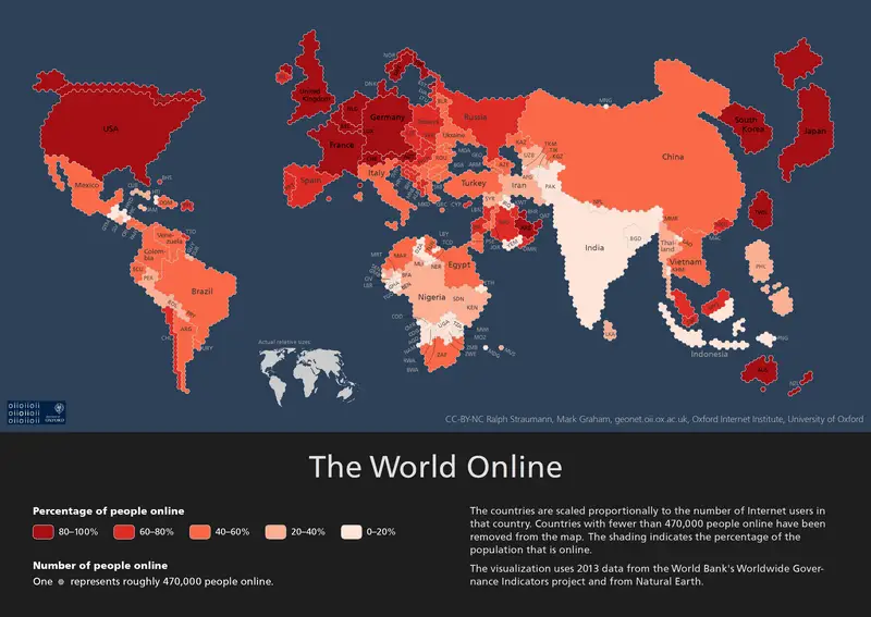
We’ve all seen how Mercator maps distort the real size of land masses as they approach the poles. For example, Mercator shows Greenland as being larger than Australia whereas, in reality, Australia is more than 3.5 times larger than Greenland! And we’ve seen political maps that try to divide the goodies from the baddies while simultaneously distorting borders. But this is the first time I’ve seen the world mapped according to the number of online residents.
Suddenly, Australia is dwarfed by Japan and even the UK! The USA has all but swallowed Canada! China’s taken all of Russia east of the Urals and Russia itself is now no larger than Germany!
To see a larger and clearer version of the map, click here…
Sure China has 1.5 billion people, but that’s not why it now dwarfs Russia, or for that matter, India with it’s 1.3 billion population. It’s because it has vastly more online users than Russia (or India) does. The map scales with each hexagon representing 470,000 online users.
If you subscribe to the theory that internet usage leads to innovation and economic growth – and I do, it’s easy to see where the emerging economies lie. China has plenty of steam left as do South Korea, Taiwan and Japan. But my money is on the future growth of Vietnam, Brazil, the Philippines, Mexico and even Nigeria which, if you look, has subsumed half of the African continent!
What do you think? I’d love to read your comments!


