The digital world mapped!
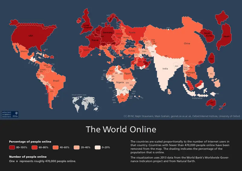
We’ve all seen how Mercator maps distort the real size of land masses as they approach the poles. For example, Mercator shows Greenland as being larger than Australia whereas, in reality, Australia is more than 3.5 times larger than Greenland! And we’ve seen political maps that try to divide the goodies from the baddies while […]